Why ‘sendPACT’
sendPACT stands for: children with special needs and disabilities (SEND) Parents and Carers Team (PACT). We didn’t want to use all capitals for our name but wanted to emphasise the fact that it is parents/carers who fight for their children’s rights and do anything to improve their children’s futures, and we are that group.
The logo design
The sendPACT logo has been designed in the shape of a sun with each ray in a different colour to represent diversity within the SEND community, where we are all different but united for a common cause. The rays are all in the same size because we believe we are all equal, not one more important than the other. The rays come together to meet in the middle circle that represents the future we want to create for our SEND children and families.
The magenta colour
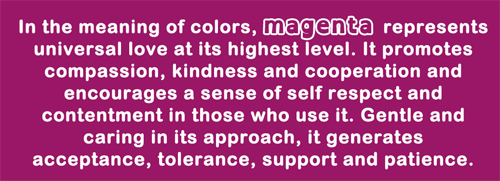
Central to our logo is the colour magenta, a combination of red and violet. We chose magenta as our primary colour because it is spiritual and practical, encouraging common sense and a balanced outlook on life. This colour is said to strengthen our intuition and helps us to rise above the struggles of our daily lives by uplifting our spirits during times of unhappiness, anger or frustration.
More importantly, magenta is a symbol of change and transformation – sendPACT’s core ambition – to move away from old and outdated patterns of behaviour into lasting growth and development.
The font
Our logo font for ‘sendPACT’ is Open Dyslexic, a font especially adapted for people with reading difficulties. We chose this font because it makes the letters easily distinguishable.
